Follow Kaitie Foley on Twitter!
Our list of the Top 10 Wichita Logo Designs picked by Wichita Design Company. Wichita Kansas has an amazing Art History and our list features local companies with logos that set themselves apart from the crowd with their creativity and eye appeal. Want to see who made the cut? We invite you to comment, pick out your favorites, or take a moment and let us know about another logo that you enjoy.
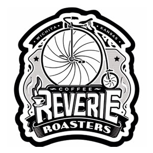 1. Reverie Coffee Roasters
Reverie’s visual identity is artistically quirky yet simultaneously elegant and classic. Its bold design and commanding lines garner attention while white space guides the viewers eyes through the logo. Their bicycle pays homage to their signature blend of Boneshaker coffee, named after the classic big-wheeled bike. Reverie perfectly blends the design of their logo, just as they blend their locally roasted coffee.
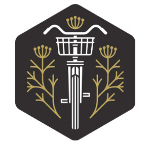 2. Fork and Fennel
A new addition to Wichita and they’ve introduced themselves with a wonderful visual identity. Their logo embodies a charming local flair that matches the atmosphere of their restaurant. The sprigs of fennel in their logo are a nice homage to their name.
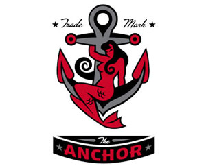 3. The Anchor
When one thinks of downtown Wichita, it’s easy to picture that mesmerizing mermaid perched on her anchor. The Anchor’s logo is practically a landmark in Wichita. It’s a beacon reminding individuals that they’re driving into Old Town. Not only is it aesthetically pleasing for various design reasons, it’s also a Wichita classic.
 4. Startup Wichita
Startup ventures are beginning to sprout up all across the country, so it’s no surprise that Wichita has its own group dedicated to the pursuit of creativity and entrepreneurial efforts. That said, their logo certainly reflects their mission. Simple in nature with bold and decisive lines that have a weightless power. The shape of their visual identity conjures up a similarity to the shape and gravitas of the Keeper of the Plains.
 5. Tallgrass Film Festival
Independently stubborn meets great design! While their visual identity changes from year to year, the lovely typography of Tallgrass’s logo is a keeper! It does a wonderful job of representing the artistic and quirky ventures Tallgrass embarks on each year.
 6. Kansas Aviation Museum
A lovely logo that’s simplified yet remains elegant with its use of line. It perfectly captures the grace and weightlessness of flight. The light text lying below the logo compliments the visual weight of the plane while creating a sense of balance.
 7. District Taqueria
Simplistic and easily recognizable, this new business is leaving its mark with a visually pleasing logo. The use of white space complimented by smart design makes it a winner.
 8. The Monarch
Sometimes, more is just more. The Monarch’s logo proves that simplicity goes a long way. Their aesthetic isn’t fussy and relies on sharp points and abundant negative space to create visual interest. The logo’s straightforward nature makes it stand out without overcomplicating anything.
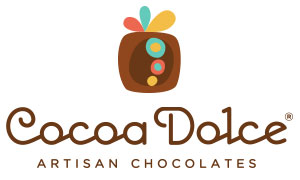 9. Cocoa Dolce
If a logo can make someone hungry, then Cocoa Dolce’s does just that. Their logo utilizes a playful color palette that conjures up the image of their delectable creations. Their visual identity also uses a charming font to match their whimsical logo.
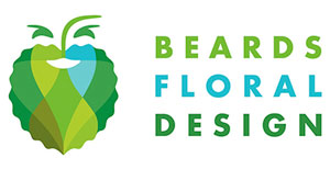 10. Beard’s Floral
Designed by the same artist who created The Anchor’s logo, Beard’s visual identity is a delight. From the bushy beard matching the business owner’s facial hair, to the cheerful colors that bring this logo to life, it’s a sheer delight to look at. Not to mention, if you look closely you might notice the man’s face and beard become a tree when flipped upside down. Overall, Beard’s logo is clever and artistic; exactly like their arrangements.
A unique logo design is the best way to establish your brand to make an impact on your customers. Let Wichita Design Co. create a logo for your company that customers will remember.

Leave a Reply